cartography, infographics and data visualization
I have always been a fan of cartography, which might be the highest form of infographic, or data visualization. There is so much information displayed on a map in both shape and color as well as words and numbers, all of which combine to give a sense of understanding of place for the reader. My earliest stint in cartography was part of a team with Access Press (a Richard Saul Wurman company) which produced the USAtlas for H.M. Gousha Maps. This road atlas was the very first produced entirely on a computer. Each map was drawn in Adobe Illustrator, every road curve and straight line, all coastline and rivers, all typography was meticulously added within Illustrator. Since then, I have always dabbled with cartography as well as other forms of data visualization including charts, tables, and long strands of text as well as multiple columns and rows of numbers from surveys and spread sheets. Below are some of my samples.
Recreated in Adobe Illustrator, this Replica of Diagram: No. 2. is from the 1660 publication Astrolabium. Originally drawn by Franz Ritter, an astronomer and cartographer, perhaps best-known his 'sundial' world map. Ritter specialized in the design and manufacture of astrolabes, sundials, and other scientific instruments. Below is a scan of the original obtained at https://www.davidrumsey.com/
I am not an astrologer, but I do pay attention to the days of the week and how time goes by through the year. I have always made my own work calendar to keep track of my important dates throughout the year. I put together a calendar this year with family birthdays, I liked the idea of time repeating itself and going around in circle. This calendar indicates months, days of the week, along with the seasons and moon cycles. I figured I could add the astrological signs as well as planets in retrograde. I found there is a lot of contradictory information about when planets go in and out of retrograde.
This too, was made with Adobe Illustrator on a 20x20” artboard.
map for a self-guided tree tour of the historic sonoma plaza. created in adobe illustrator
the plans of the sonoma plaza were obtained at city hall (in the center), scanned to 7200x7200 then recreated with vector lines and color
infographics
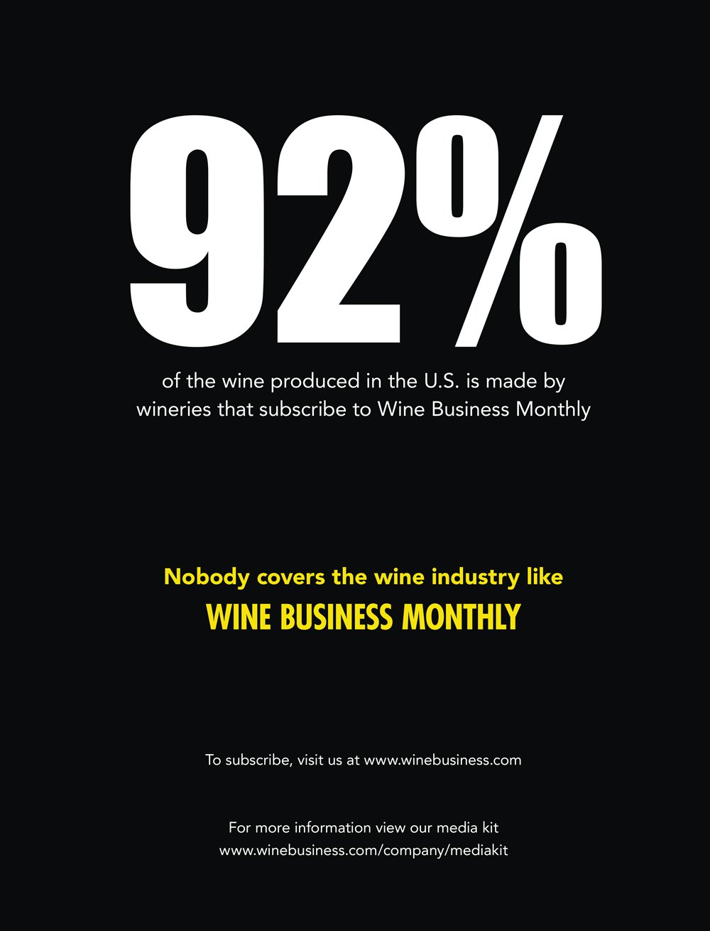
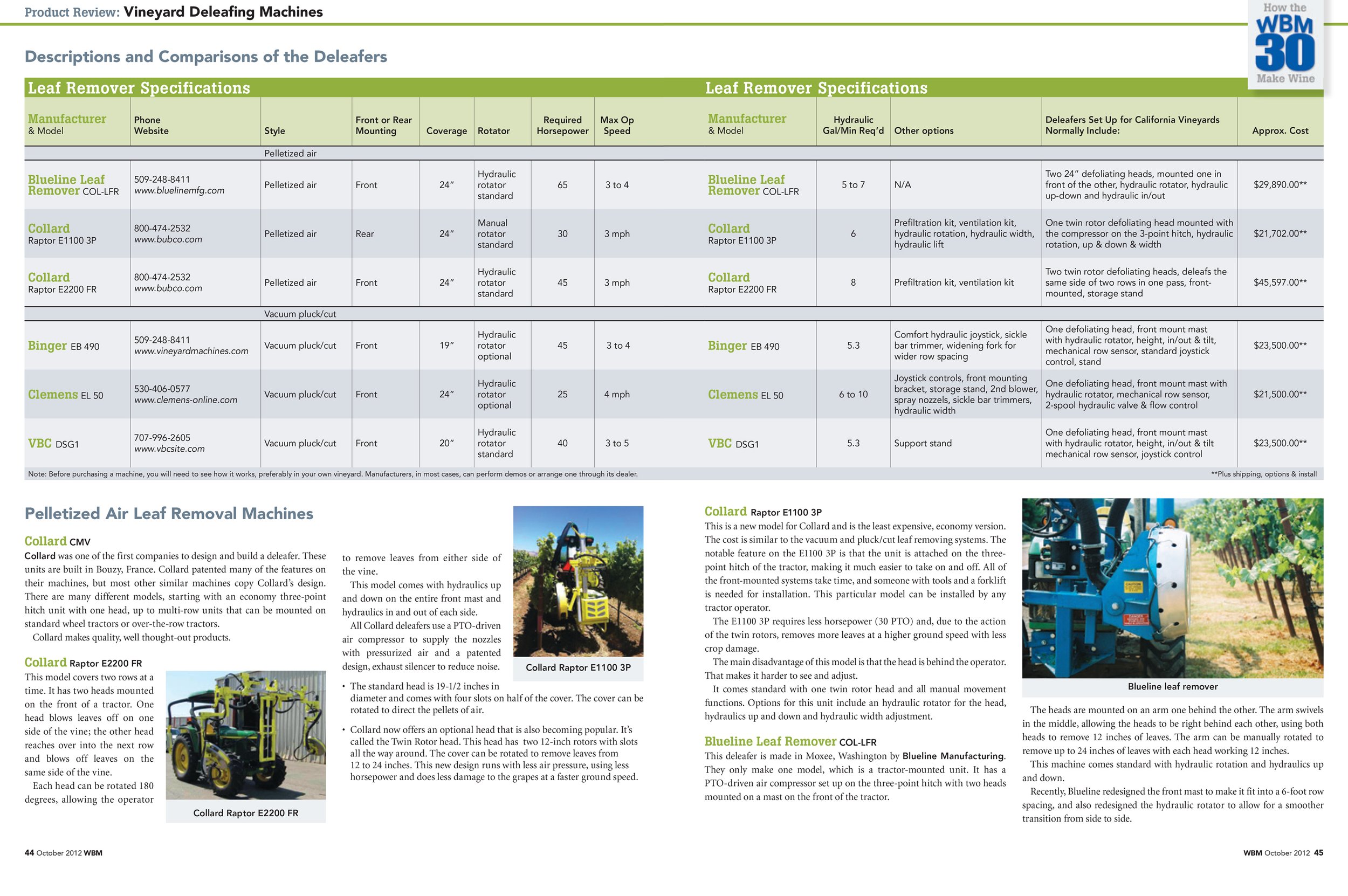
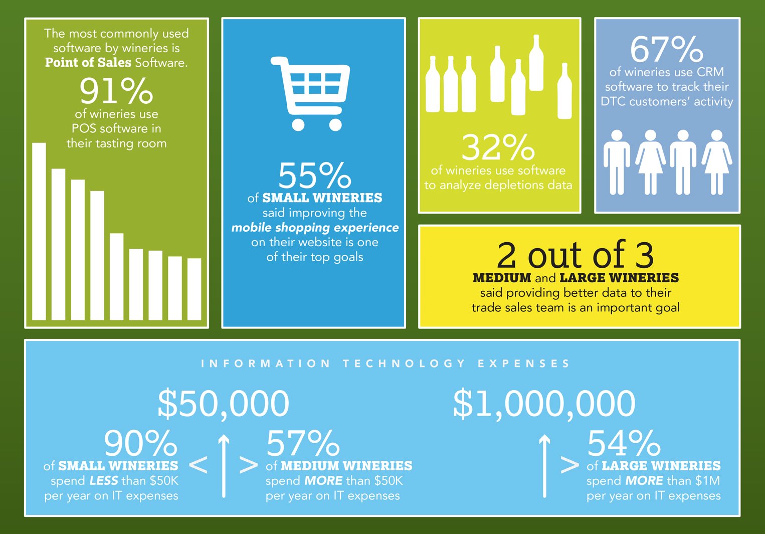
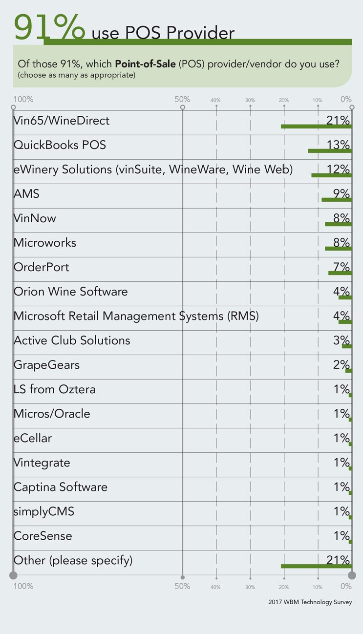
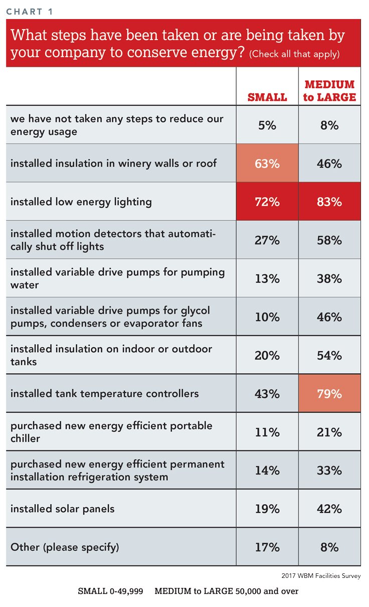
Data visualization was a big part of the magazines I designed over the years. The information we put forth was intended for the business side of the industry, knowledgable growers, winemakers and sales teams. It was often quite dense and took some time for me to understand so I could best display it with simplicity. Here are a few samples of the data visualizations I came up with.
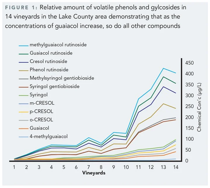
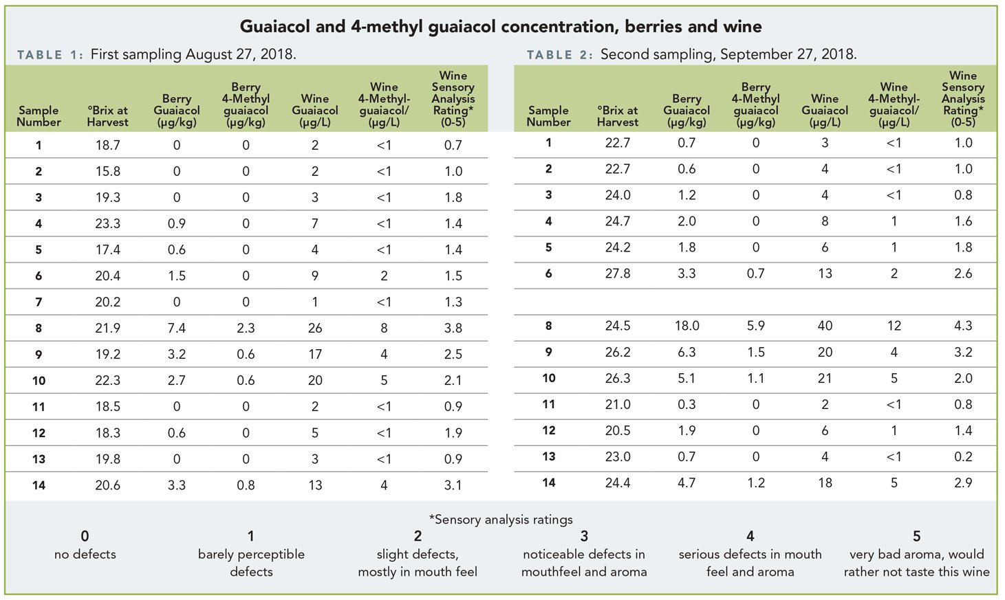
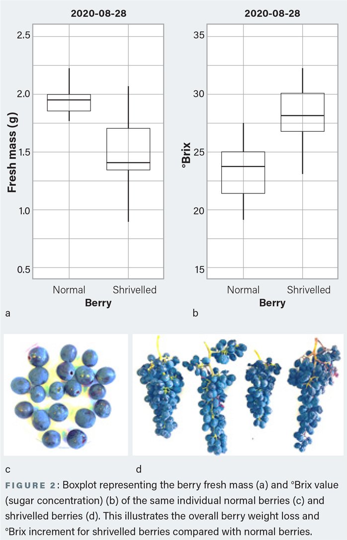
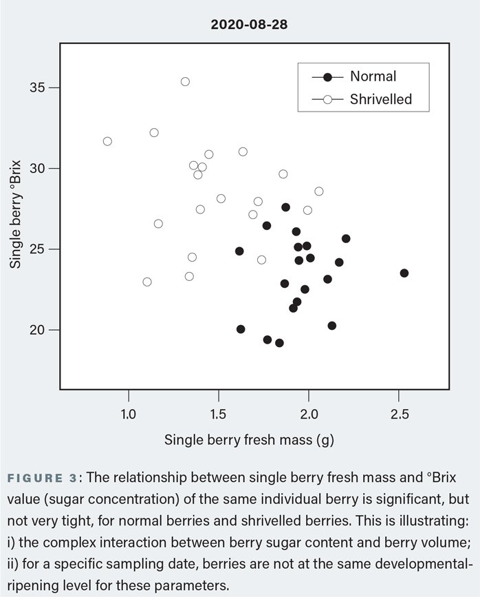
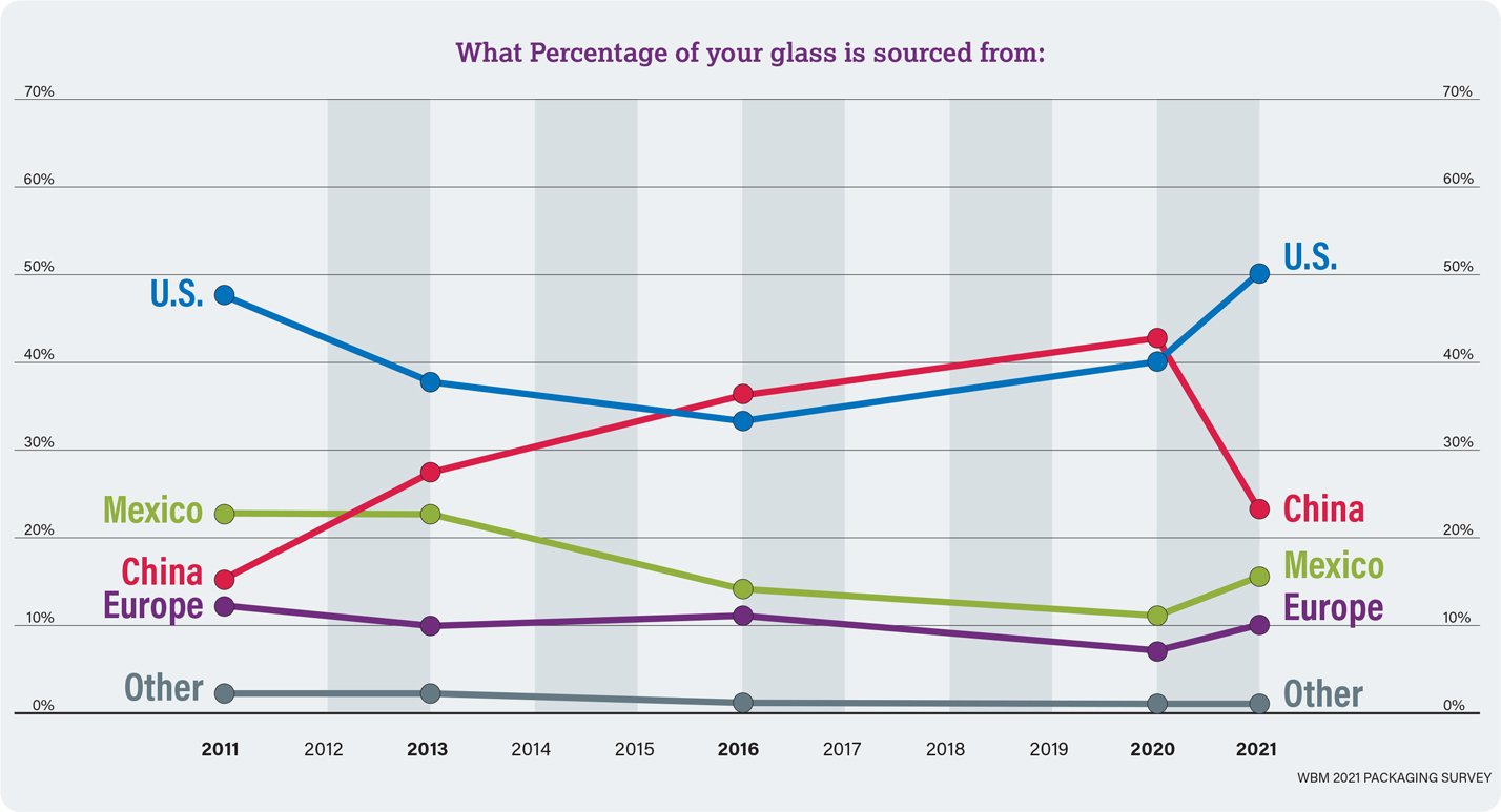
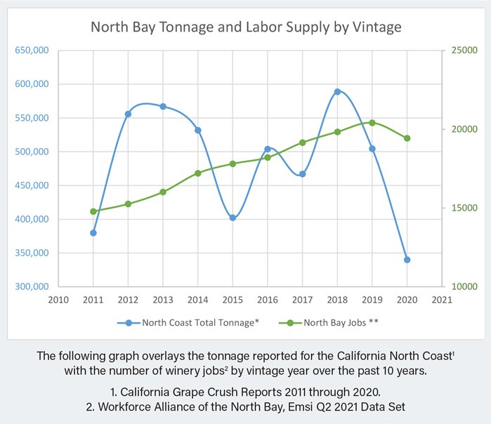
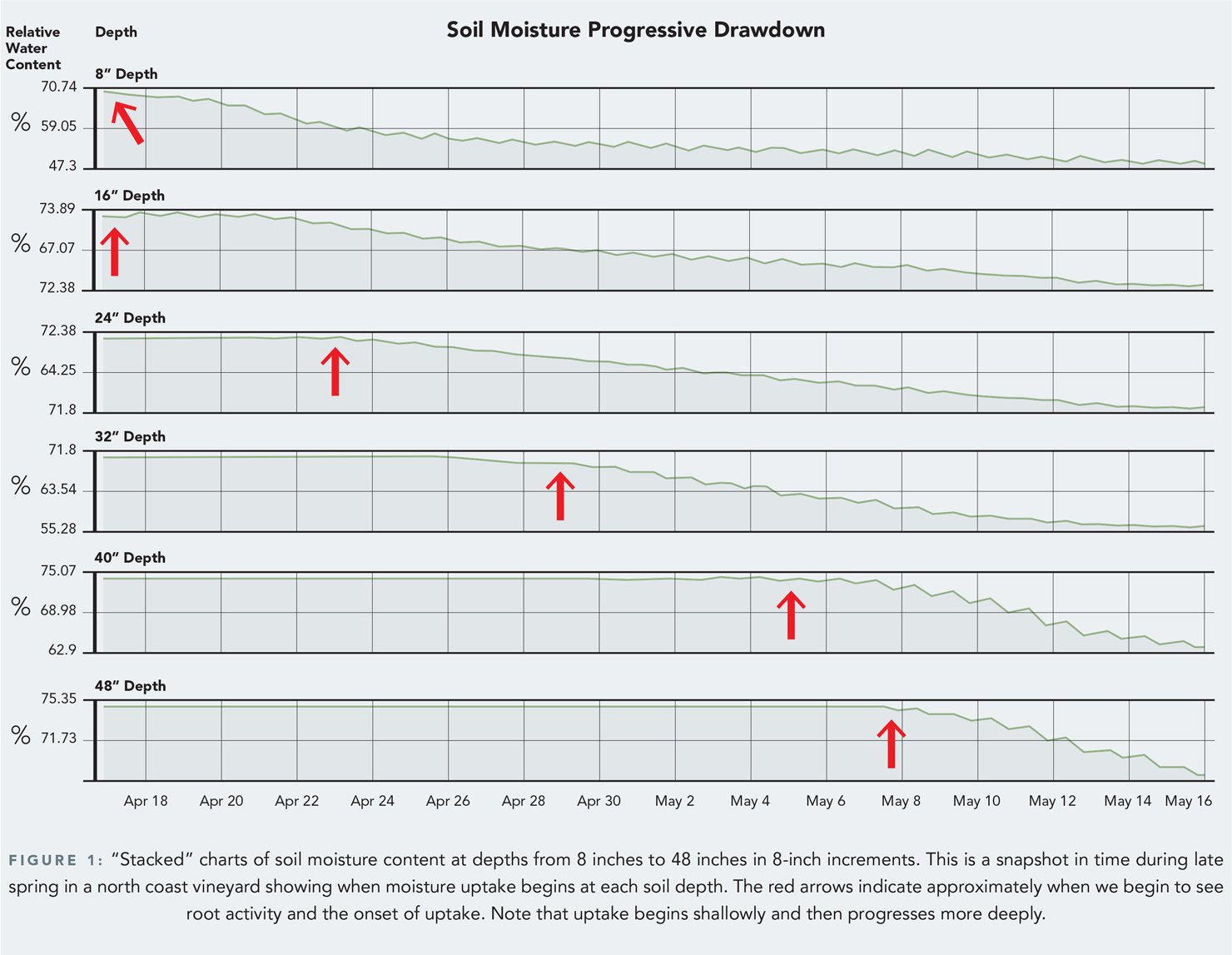
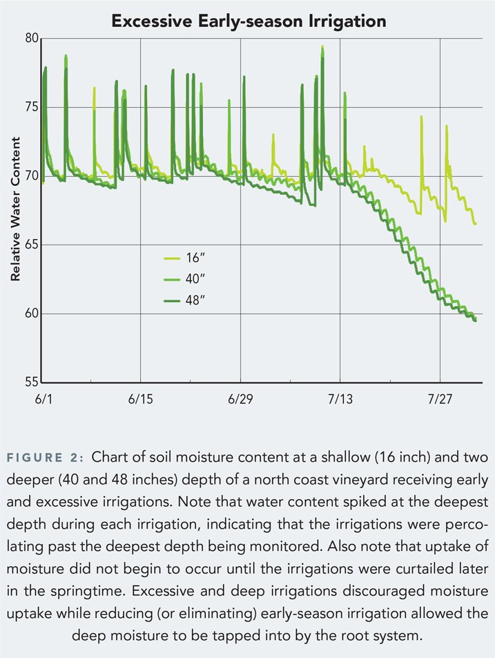
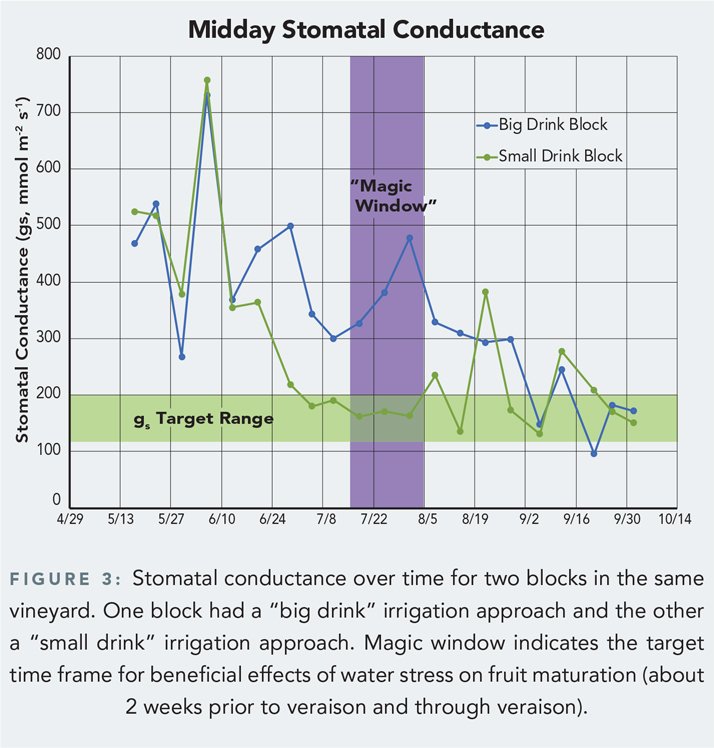
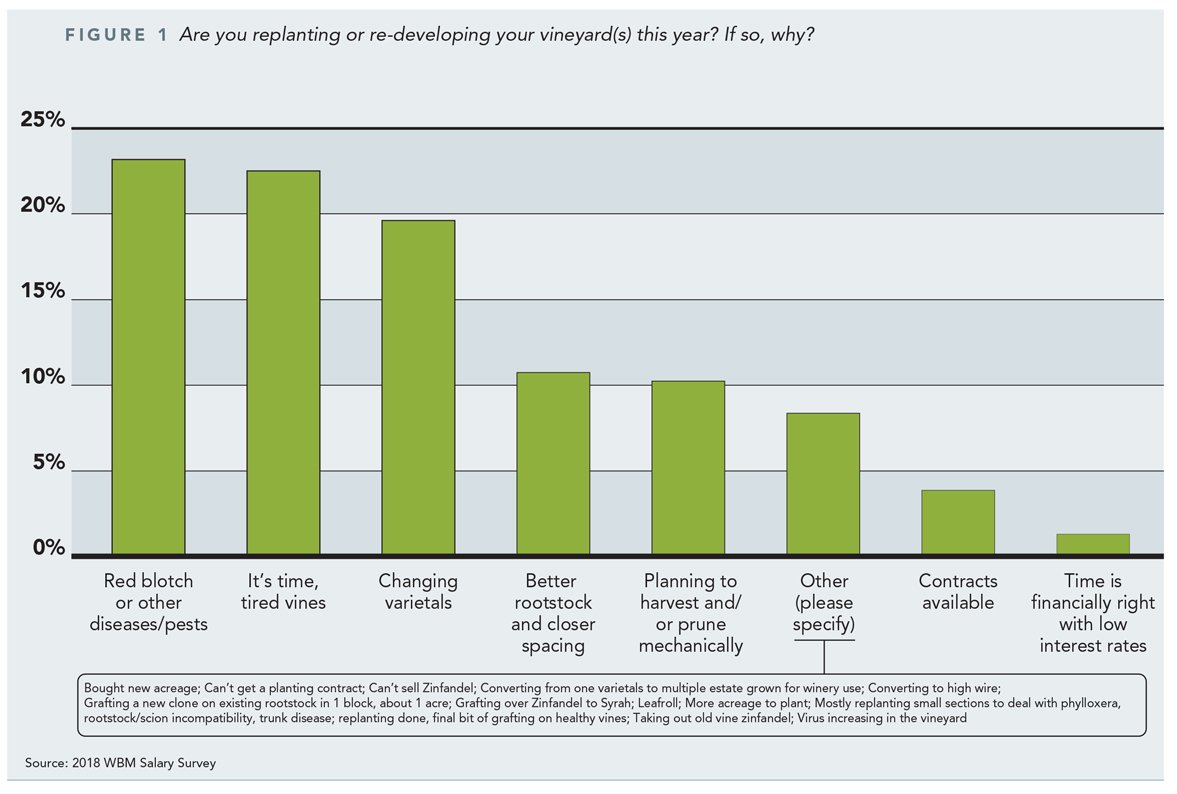
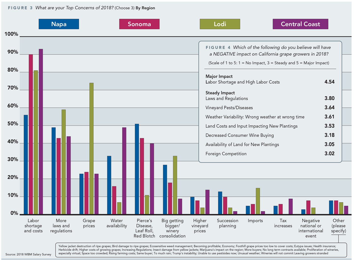
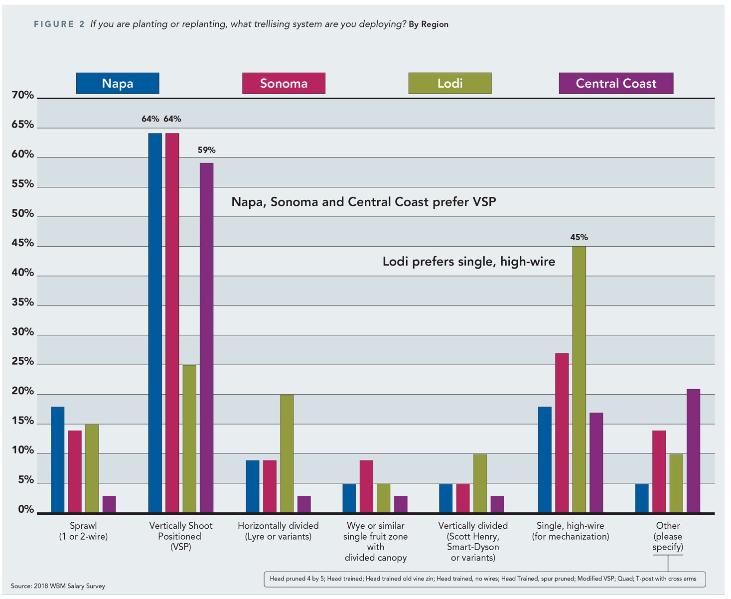
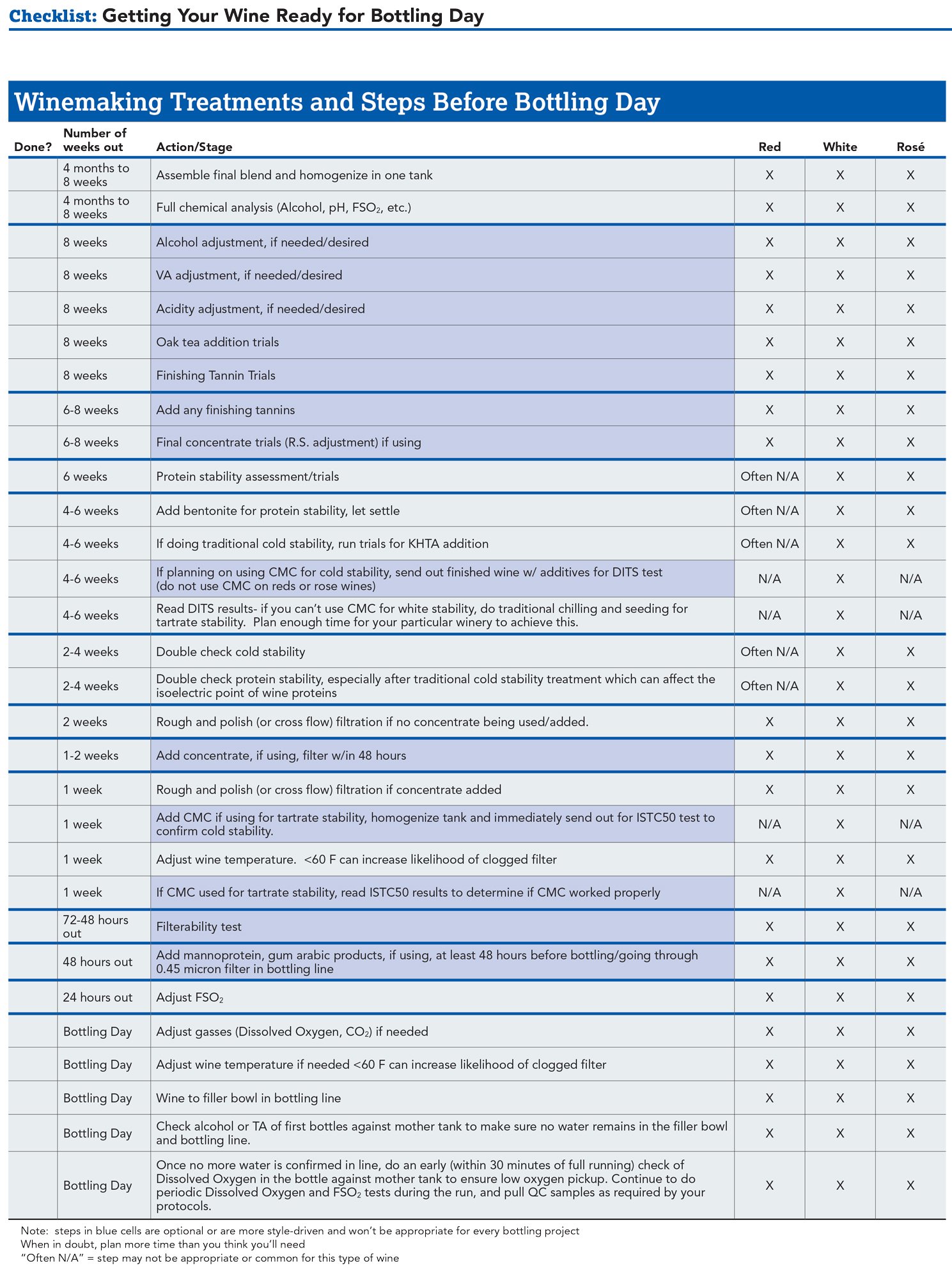
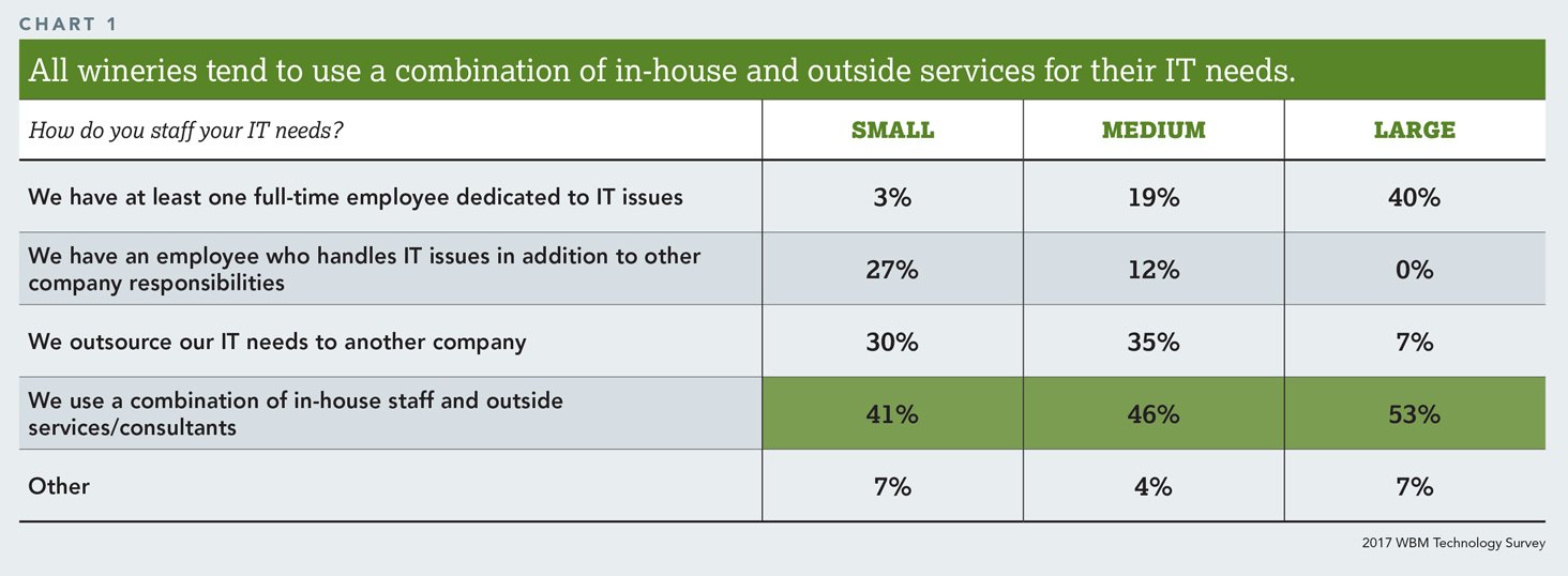
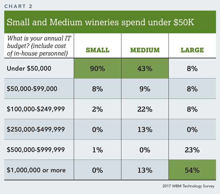
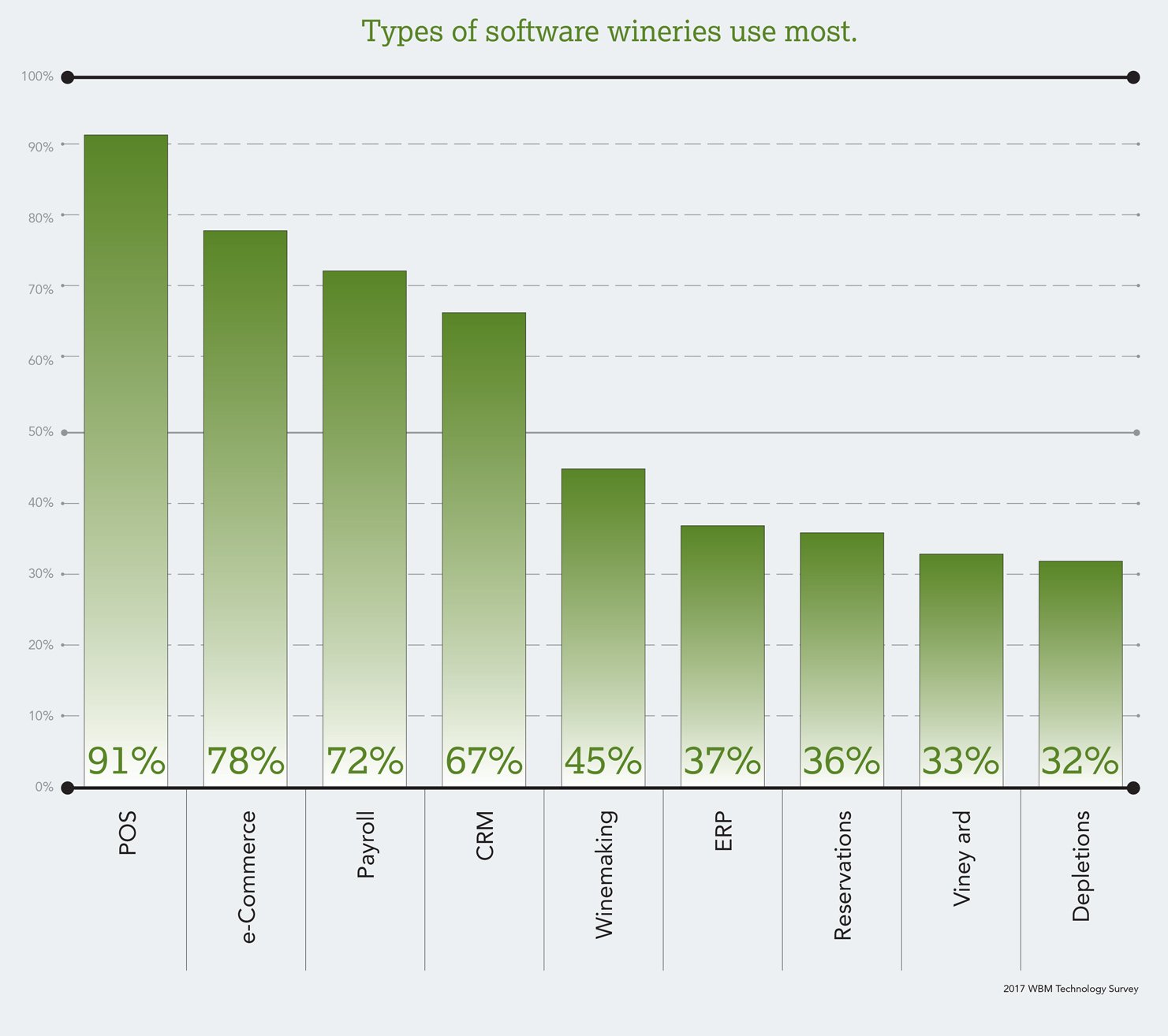
Each issue of Wine Business Monthly magazine there is a section that contains off-premise retail wine sales data collected by the Nielsen company. The data includes both dollar values and volume of wine sold in grocery, drug and warehouse stores among others. It breaks the numbers into multiple categories from grape varietal, region, type of container, price points and lists them over two different time durations, 52-week and 4-week. Each month, the editor would pull out the highlights and task me to put together charts and tables to show off this data. We charted much of this information over the course of the year to give trended visualizations of the data.
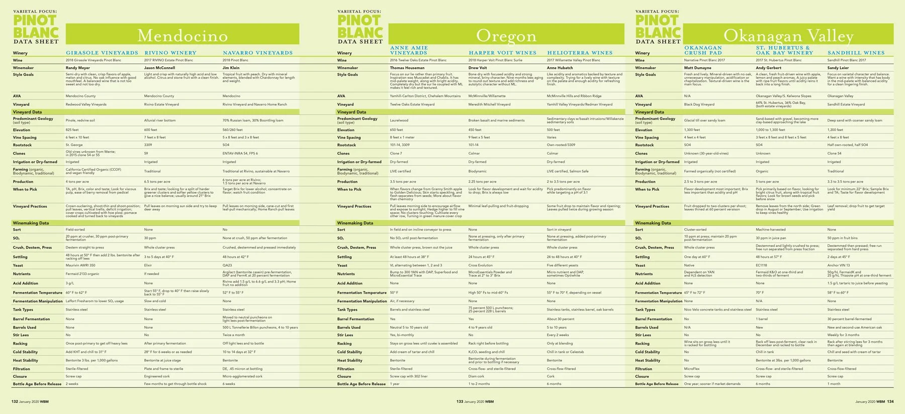
One series we published at Wine Business Monthly was called “varietal focus.” The writer, Lance Cutler, interviewed nine winemakers, three from three regions that were known for the specific varietal. There were a series of questions regarding style goals along with methods of growing and winemaking techniques. Then there were tastings of each wine and tasting notes presented to the readers. Each of the 20 varietal focus articles had a matrix which contained all of the data from each wine made ~ there was a lot. I ended up designing a 3-page spread (2-page + gatefold) to present the data from each winemaker. Broken into the three regions, plus the vineyard data separate from the cellar data made this amount of information a bit easier to sift through. This series was always a highlight within the year for our readers. For me, as the designer, I was always allowed some latitude when designing using bolder colors and fonts, while keeping the layout organized.
Another WBM operation were events. For the Wine & Viticulture event, I created this exhibit floor plan and site map (right) for a 2019 trade show which appeared on large format signage, as well as within the event’s program. It shows each exhibitor and booth location, along with their sponsorship level. After a few year’s hiatus the event took place once again in 2022, (below). These maps and signage were created in Adobe Illustrator.
Mountain Cemetery walking tour
Fred Allebach approached me to work with him and put together a tour of the local cemetery based on his research of the many historical interests within. Established in 1841 the Mountain Cemetery is one of the oldest operating cemeteries in the western U.S.
front cover of the 4-panel flyer available at the Overlook Trial kiosk.
full sized map of the Mountain Cemetery walking tour, created with Adobe Illustrator
more than 40 points of interest highlighted in this tour. this portion of the brochure was laid out with InDesign.
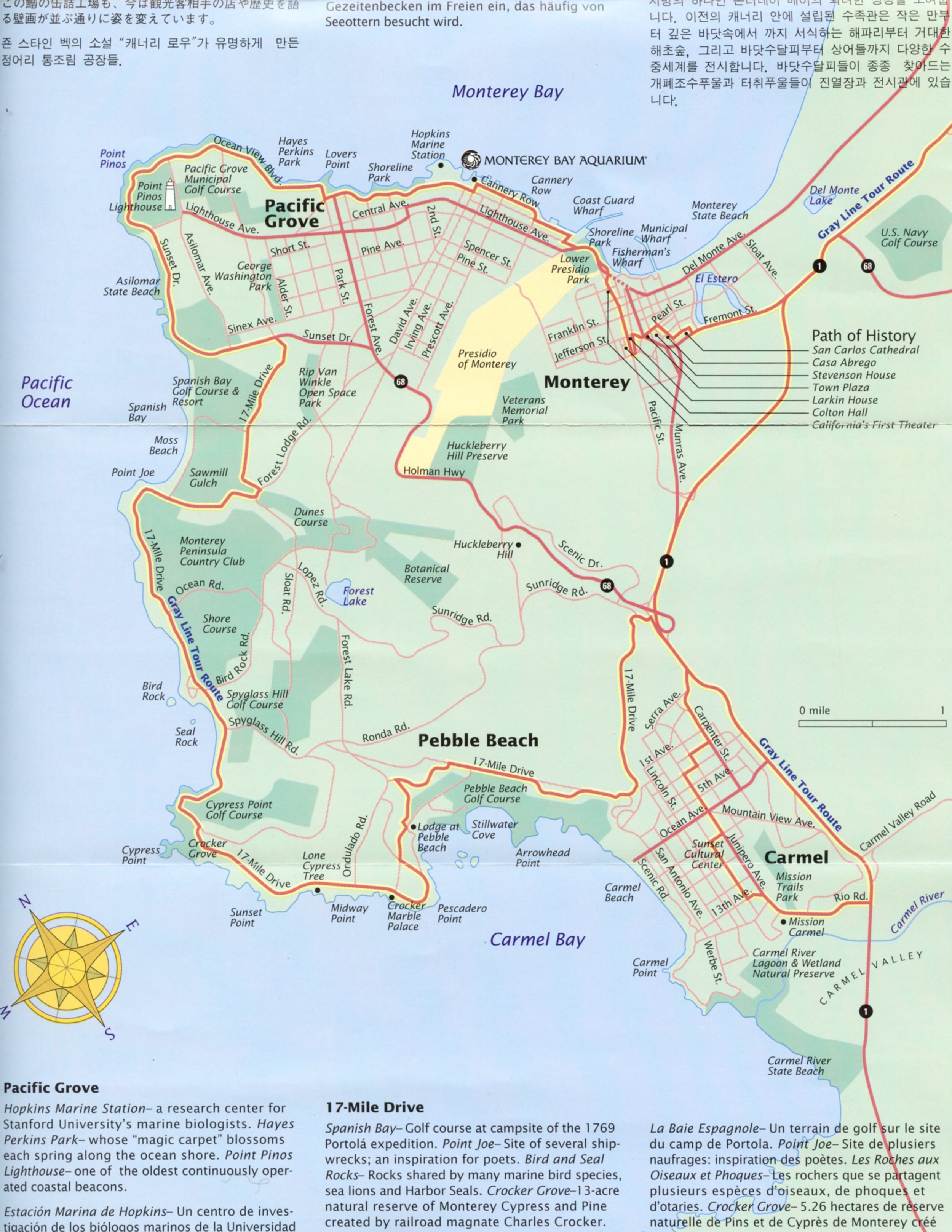
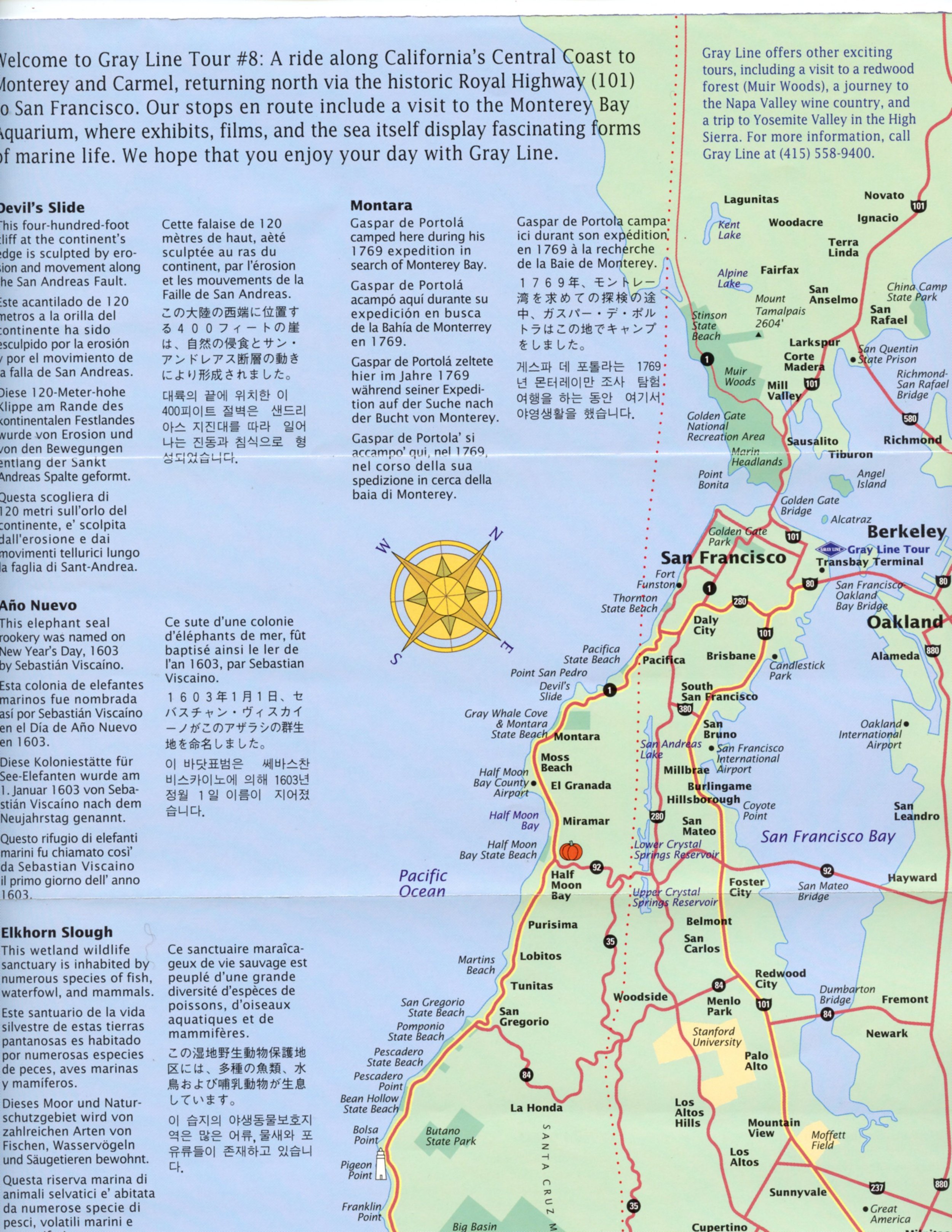
I created this set of maps for a design studio called HOT studio. The brochure highlighted “Tour #8,” a specific Grey Line Tours route which traveled between San Francisco and the Monterey peninsula. The map was created in Adobe Illustrator using a scan of a USGS map, traced with the pen tool using bezier curves. I use the layers as well to differentiate the hierarchy of elements within the map, coastline, parks, roads and the road itself. Type faces also get their own layers to help organize the parts.
work in progress… USGS offers free digitized 1:24,000 maps which are editable in Illustrator. I used the line work from that to create a running and biking route/distance map from my home in sonoma.


